Custom action icons
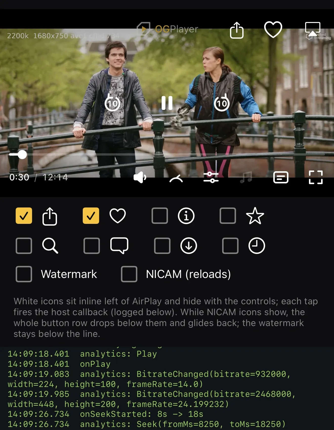
Add your own icon-only buttons — share, favorite, info, whatever your product needs — and the SDK renders them in the top-end control row (left of the cast/AirPlay position), tinted like the chrome, hiding with the controls and suppressed during ad breaks. Maximum 8; order is render order.
OGUiConfig.Builder() .setCustomActions( listOf( CustomAction(R.drawable.ic_share, "Share") { share() }, CustomAction(R.drawable.ic_heart, "Favorite") { favorite() }, ), ) .build()var config = OGUIConfig()config.customActions = [ CustomAction(icon: Image(systemName: "square.and.arrow.up"), accessibilityLabel: "Share") { share() }, CustomAction(icon: Image(systemName: "heart"), accessibilityLabel: "Favorite") { favorite() },]el.config = { customActions: [ { svg: shareSvg, accessibilityLabel: "Share", onClick: () => share() }, { svg: heartSvg, accessibilityLabel: "Favorite", onClick: () => favorite() }, ],};<OGPlayerView style={styles.player} source={{ url }} uiConfig={{ customActions: [ { iconName: "ic_share", accessibilityLabel: "Share" }, { iconName: "ic_heart", accessibilityLabel: "Favorite" }, ], }} onCustomAction={(index) => (index === 0 ? share() : favorite())}/>Icons are referenced by name from the app’s native resources (Android
res/drawable, iOS asset catalog); taps arrive as the action’s index in
onCustomAction.
OGPlayerView( source: OGMediaItem(url: url), uiConfig: const OGUIConfig( customActions: [ CustomActionConfig(iconName: 'ic_share', accessibilityLabel: 'Share'), CustomActionConfig(iconName: 'ic_heart', accessibilityLabel: 'Favorite'), ], ), onCustomAction: (index) => index == 0 ? share() : favorite(),)Icons are referenced by name from the app’s native resources (Android
res/drawable — prefix them og_ so release shrinking keeps them; iOS asset
catalog); taps arrive as the action’s index in onCustomAction.
Choreography you get for free: when content-rating icons are showing, the action row drops below them (same reflow as the title and watermark), and the whole row disappears during ads.